Modeling COVID-19 Spread at UCLA
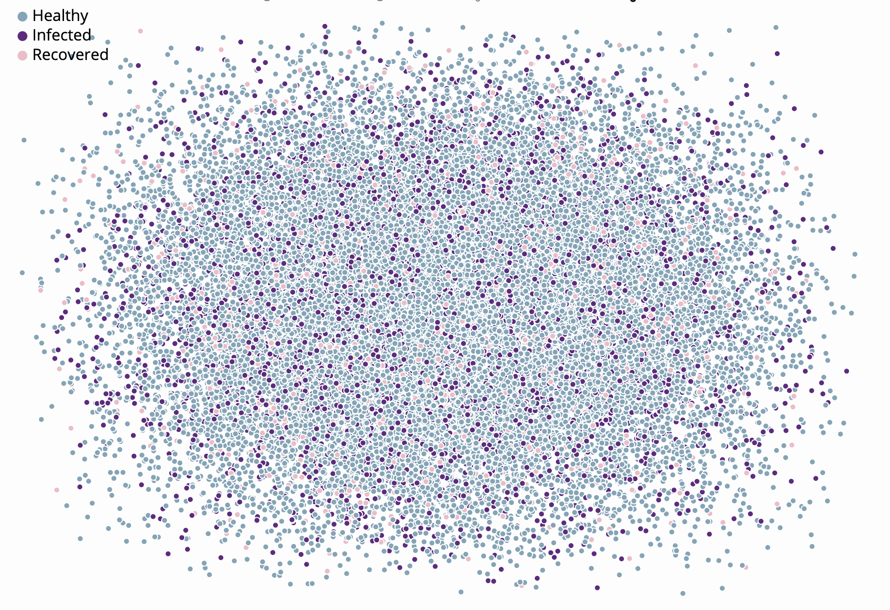
Developed a network of student interactions in classrooms using stochastic block models and the NetworkX library in Python, and implemented an SIR model in Javascript using networks in D3 to animate 10 weeks of coronavirus spread.
Projecting Hospital Resources Required at UCLA during COVID-19

Developed story that maps hospitals in LA with information about the number of hospital beds and a chart projected into the future to estimate how the spread of COVID-19 within the UCLA community (if it opened up) would impact the local hospital capacity.
Timeline Comparing School's Responses to COVID-19

Developer a bar chart race showing the explosion of cases in the surrounding county of each college, with annotations for school's response events like switching to online instruction, postponing graduation, etc.
Mapping Opening Status of Local Businesses

Scraped information about local businesses and plotted on map using Leaflet.
Analysis of Presidential Candidates Using Their Twitter
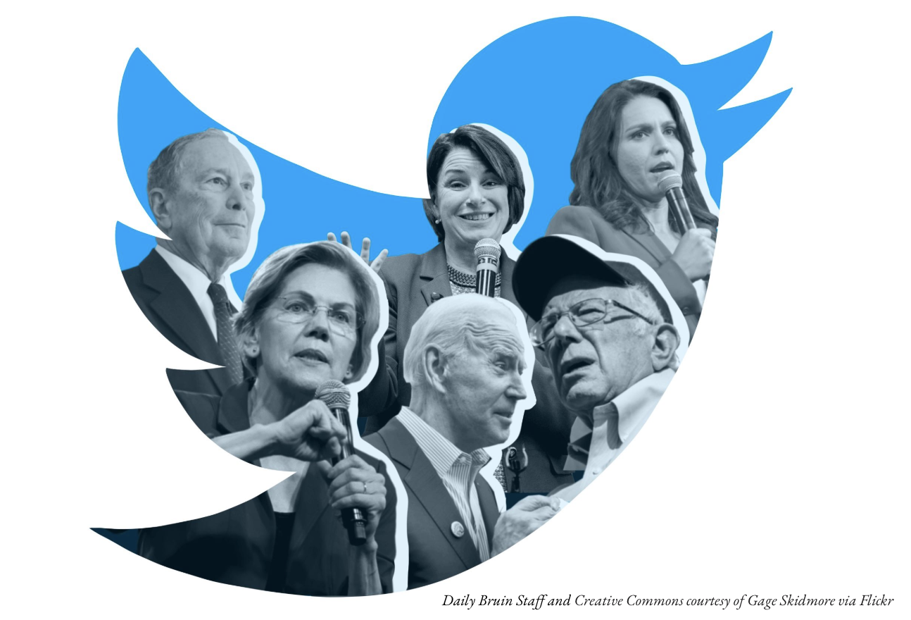
Scraped twitter feeds of all US Presidential Candidates, and generated Personality Insights using IBM Watson's Personality Insights API. Also developed interactive bubble and bar charts using ChartJS, along with front-end component to display information about personality traits and keywords most frequently used by candidates
Hidden Student Costs
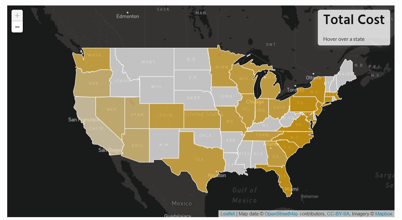
Estimated different costs of being a student based on what state or country you're from, and your living preferences. Created interactive map using Leaflet to show distribution of college expenses, a customized cost calculator in Javascript and interactive bar charts using ChartJS.
Effects of Fracking on Public Schools
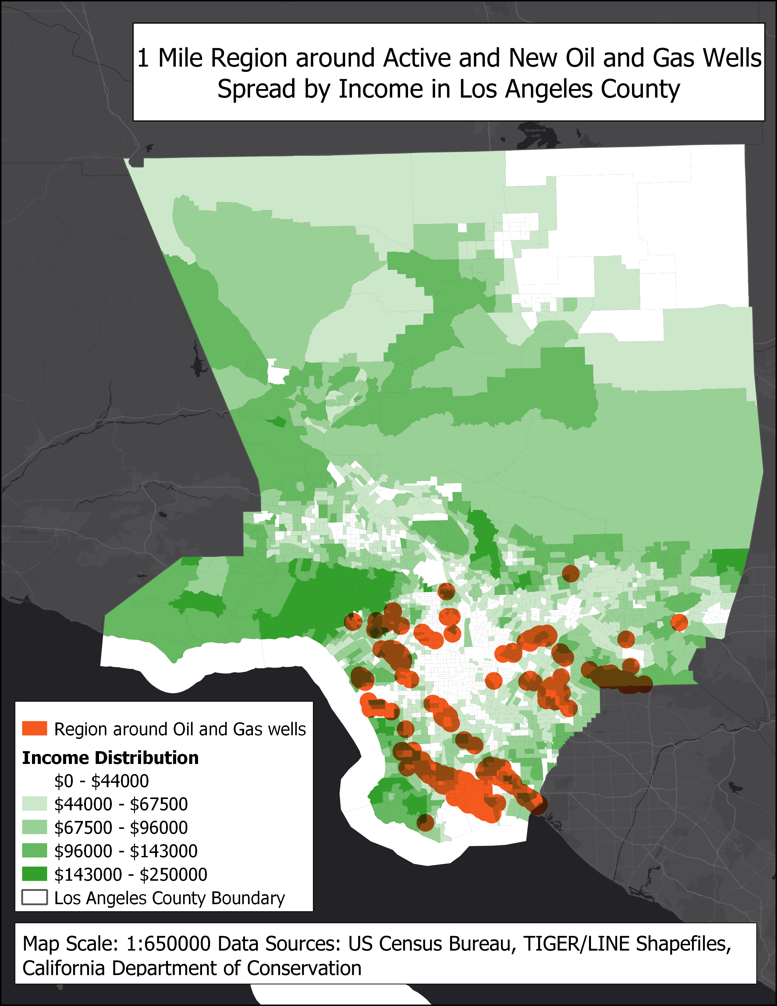
Used QGIS to plot public schools and oil wells and create buffers of overlapping regions. Also created a choropleth map showing correlation between income distribution and the likelihood of a school being near an oil well
Analyzing Crime in Los Angeles

Worked with a dataset about crime in LA to derive meaningful insights and present a Medium post. Used Python libraries like pandas and matplotlib to describe factors that make you more likely to get arrested, including time, age, location and gender with highest frequency of arrests and a heatmap describing spread of crime created using ggplot in R.